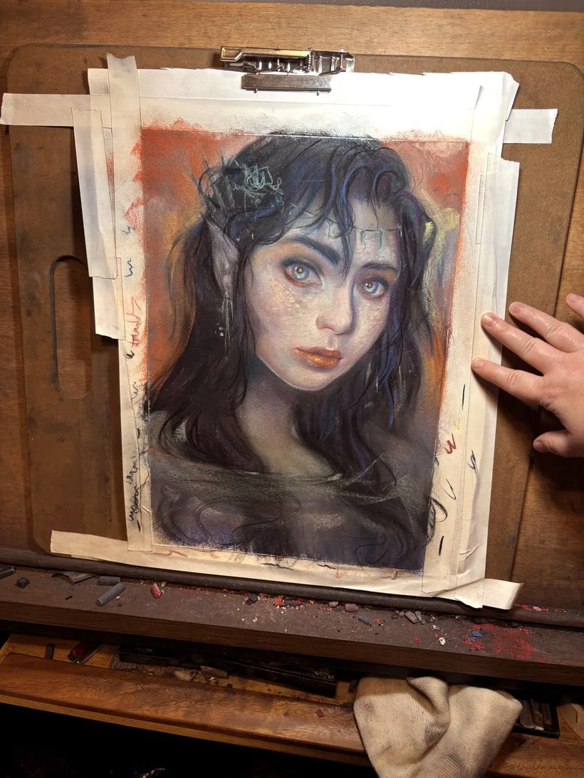
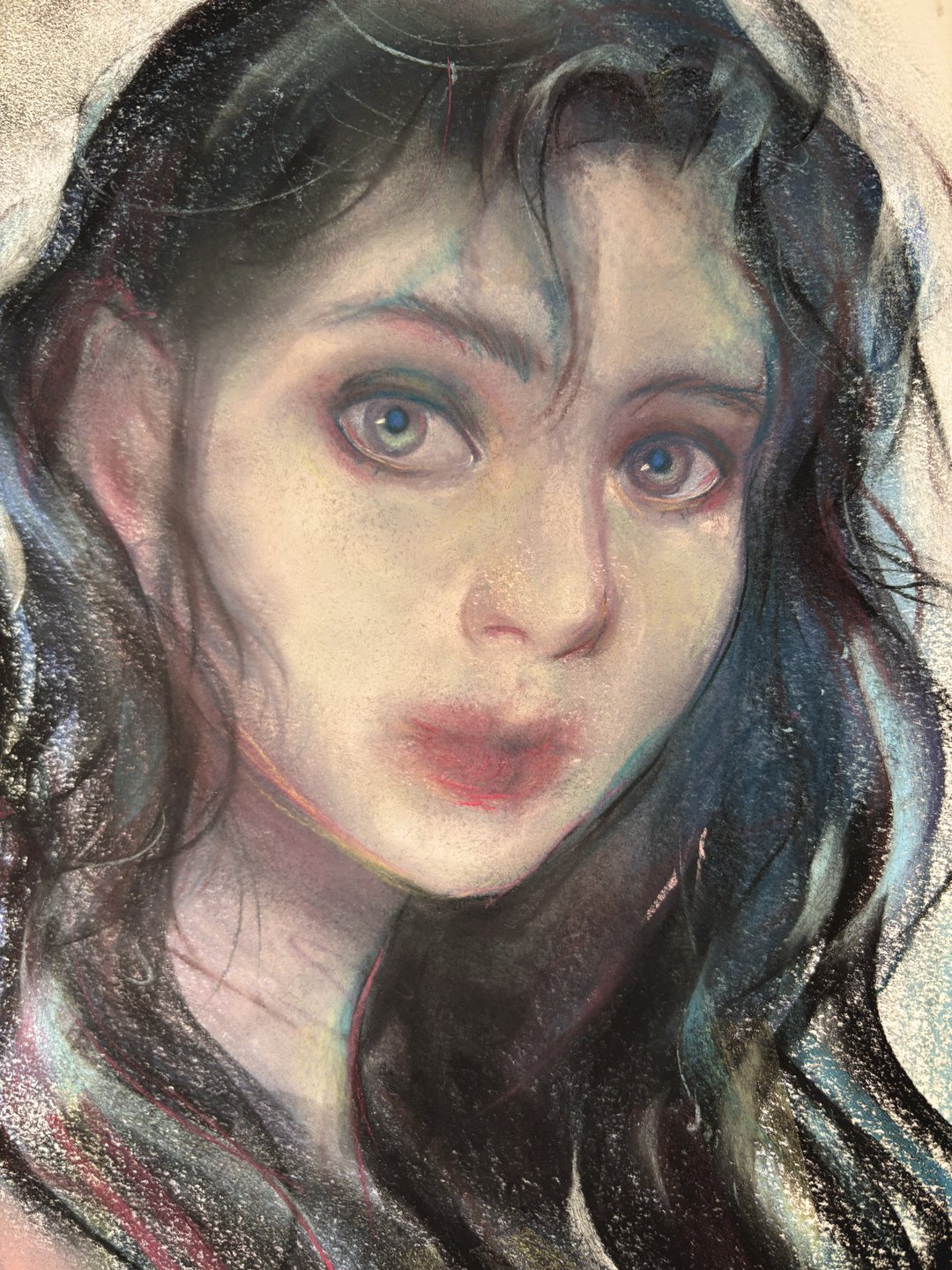
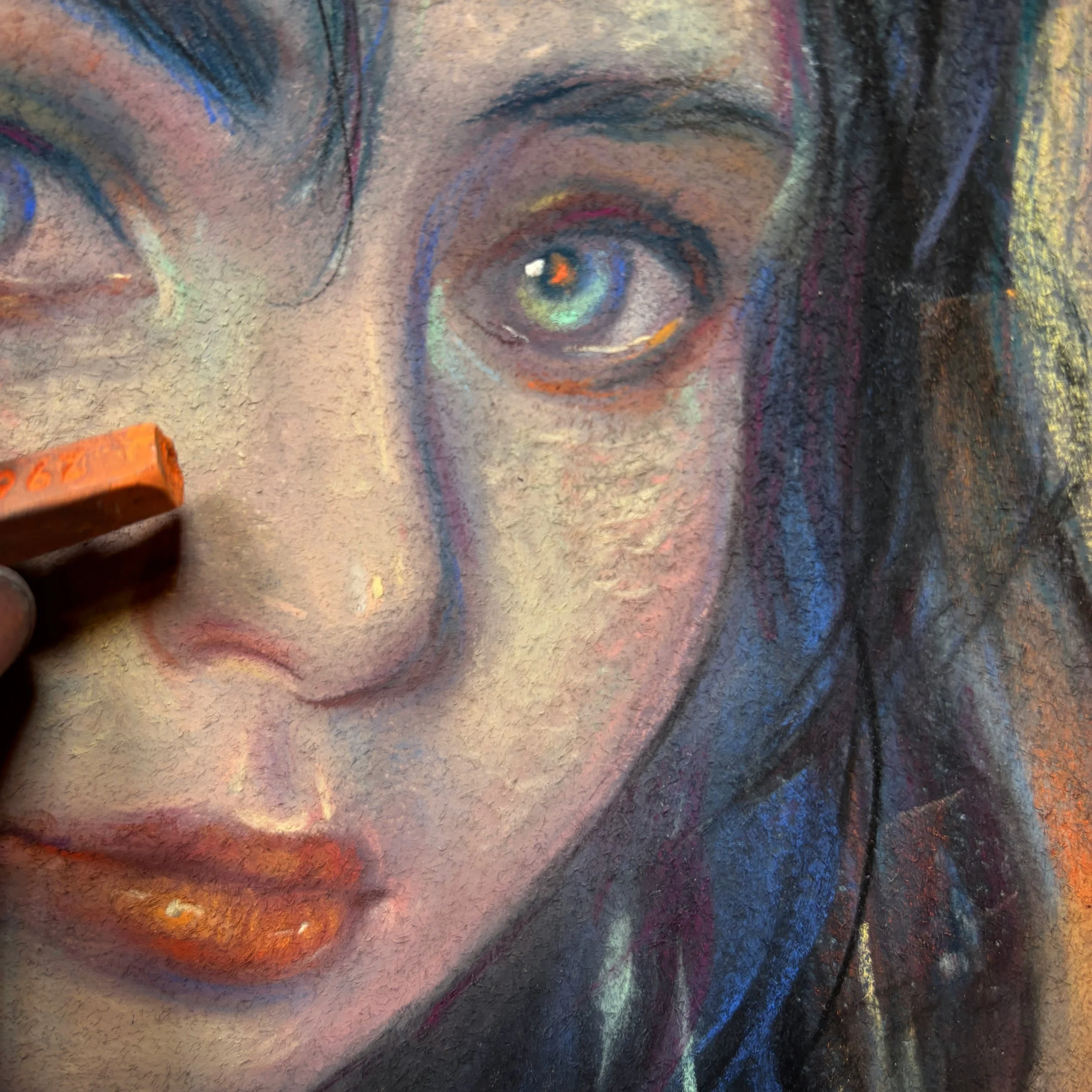
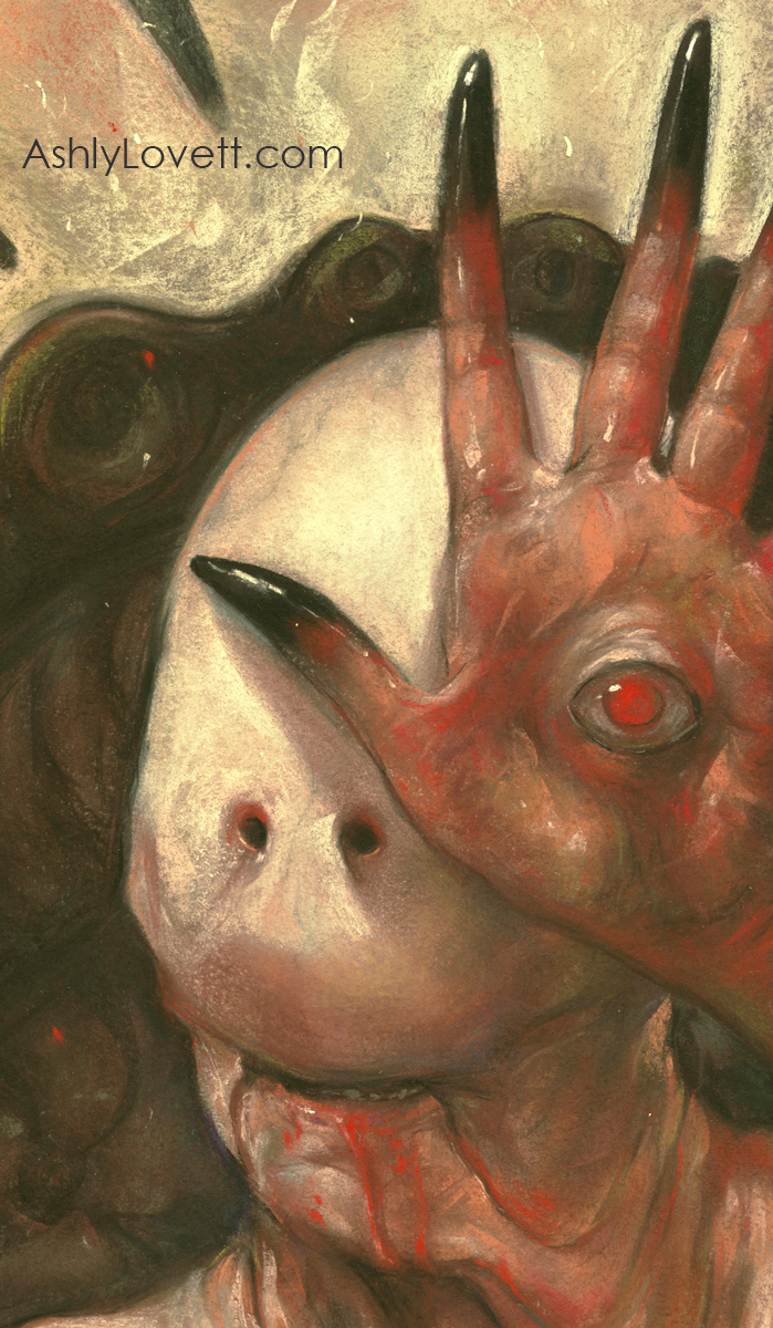
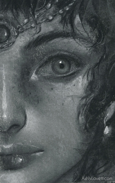
See the process and design notes behind illustrator Ashly Lovett's "Call Betelgeuse" chalk pastel drawing.
Read MoreProcess Work
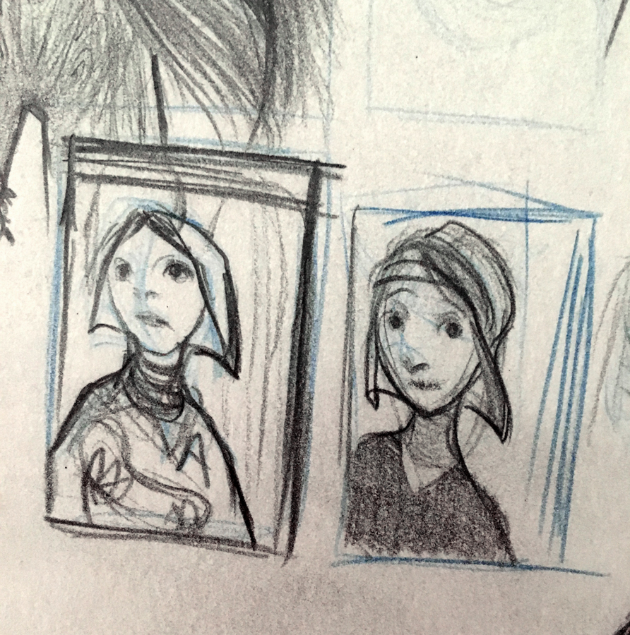
Kickstarter Thumbnails and Updates
I have a lot of questions to answer before I decided my launch date for The Little Mermaid Kickstarter. What dimension will the book be? How many pages? How many illustrations? Color or black and white or both? What time of year do I want to launch? What will my offers and goals be? And then there is all the fun logistic once I do decide on the look and size of the book.
I have decided that I want a long vertical book. Not a picture book, but an illustrated book. I'm pretty sure I want text on 2 pages and then full page spreads following. I think that would be fun. I could do a lot with that. I'll also have a few black and white spots.
I'm giving myself till Feb 1st to finalize the style and schedule for the book. I know I initially said Summer of 2018. I could either hold a limited edition print run of an illustration from the book in June. Basically a Phase 1 for the final book. And launch the book in 2019. That would give me a year or so to illustrate what I want with me doing 2 illustrations a month. That's in addition to other stuff I have going on. OR I could have the book 50% done and launch in July/Aug 2018. I'm not sure. So, my deadline to decide is Feb 1st.
I'll also be doing a tutorial for Graphite Magazine. That's due Jan 6th. I'll use that to decide on the style of the book. It'll be a portrait of our little mermaid.
To see more behind the scene sketches and get more involved in the making of this project, join my Patreon for $2 a month. You get to see all my thoughts and sketches while supporting my creation.
Gallery 1988: Pan's Labyrinth Process Work
Opening Nov 18th, 7pm at Gallery 1988 in LA.
7308 Melrose Ave, Los Angeles, CA 90046
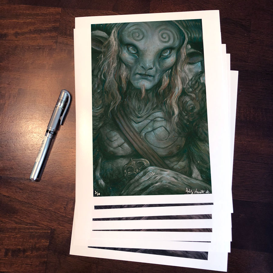
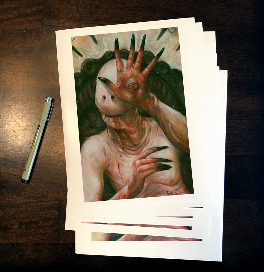
Don't miss my chalk pastel pieces of Pan's Labyrinth ( El Laberinto del Fauno) on display with Gallery 1988's Crazy 4 Cult 11 Show opening tonight at 7pm. Chalk pastel on BFK Rives paper. Both artwork pieces measure 13x20". Matted and framed with UV museum glass. Total size 21x29". Also, 10 8x10 limited edition signed prints available too.
Time-lapse Videos. Chalk Pastel on Paper.
Why Pan's Labyrinth?
I first did The Pale Man as a live demo for my patrons and Patreon. I love the film so much that I wanted to make it a series for a show I was participating in with Gallery 1988 in LA. To get involved in my next fan art piece, joining my Patreon at Patreon.com/AshlyLovett.
Movie Plot Summary
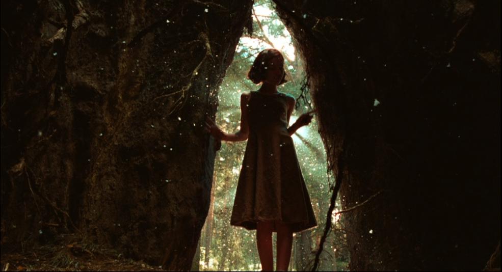
In 1944, in the post-Civil War in Spain, rebels still fight in the mountains against the falangist troops. The young and imaginative Ofelia travels with her pregnant and sick mother Carmen Vidal to the country to meet and live with her stepfather, the sadistic and cruel Captain Vidal, in an old mill. During the night, Ofelia meets a fairy and together they go to a pit in the center of a maze where they meet a faun that tells that she is a princess from a kingdom in the underground. He also tells that her father is waiting for her, but she needs to accomplish three gruesome, tough and dangerous assignments first. Meanwhile, she becomes a friend of the servant Mercedes, who is the sister of one of the rebels and actually is giving support to the group. In a dark, harsh and violent world, Ofelia lives her magical world trying to survive her tasks and sees her father and king again. - Written by Caudio Carvalho, Rio de Janeiro, Brazil. IMDB.com
Process Work: Research Stage
With the beginning of each fan art piece, I start with my research behind my character and the story. I started with the color palette.
" I used the angular, cold world of fascist-era Spain to represent reality, and a very rounded and uterine world to represent the fantasy that the child escapes into. I guess you could say that I am obsessed with images of stillborn things, and seduced by the idea that the womb is the most comfortable place to be." - The Guardian (article link here)
I also found this fascinating article about the lighting objectives and how they worked with the film's low budget and struggled with their environment:
"'The initial color differentiation between the film’s two worlds was simple: Ofelia’s fantasy world would feature mainly warm colors, primarily “deep crimsons and golden ambers, almost like amniotic fluids,' notes Del Toro....In the Pale Man’s intensely warm environment, which is dominated by red tones and a blazing fire..." -American Society of Cinematography (article link here)
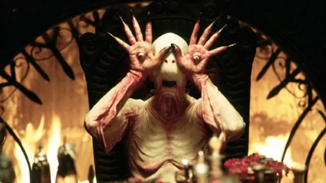
The Pale Man represents all institutional evil feeding on the helpless. In fact, this character is inspired by Saturn Devouring His Son by Francisco Goya. In an interview with Screen Anarchy Del Toro says, " The Pale Man represents the Church for me, y'know? [He] represents fascism and the Church eating the children when they have a perversely abundant banquet in front of them. There is almost a hunger to eat innocence."
It was also intended to be an old wrinkly man. However, during the sculpting stage, Del Toro wanted it more humanoid and suggested shapes similar to a manta ray. The creepiness factor went way up and they went with it. Read about it here.
Process Work: Sketch Phase
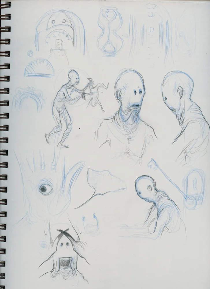
After getting a feel for the look and reason behind the character, I started sketching from the movie to get to know Mr. Pale Man better. I knew I had to include his eye hands in some way. It is a key feature of his character. Now how to do it best?
I didn't want to just take a screenshot straight from the movie. That's too easy and has been done time and time again. I wanted to showcase his wrinkles, the translucent skin, the blue veins, and I knew I wanted a long verticle to compliment his skinny form. I was lucky enough to come across David Marti's Instagram. He is the Co-owner of DDTSFX with Montse, the production company responsible for the prosthetics used for Pan's Labyrinth. There I pulled tons of reference from photos and videos. They were very helpful in understanding The Pale Man's body. I eventually found this gem of a photo on Google images searching "the pale man makeup team." (Side Note: Muddycolors.com put together an excellent post about googling references photos. Click here to read)
I did some Photoshopping-Frankeisteining and came up with a fabulous reference photo for my final illustration. From there I tapped 16x21 piece of BFK Rives paper onto my drawing board and went to town.
Process Work: Final Drawing
I work with chalk pastels on BFK Rives printmaking paper. The biggest challenge for this piece was controlling my values. I had to make a decision to either apply my details in the areas cast in light or shadow. Doing both would only make the piece overworked. Both sides would fight for interest. I chose the lighted areas. The second biggest challenge was designing the forms. This character doesn't have normal features (duh.) Normally I love working with the hair and the plains of the face to create depth, form, interest, and flow. I didn't have that option here, so I had to take great care with carefully placed shadows and highlights to show form.
The most fun was adding the highlights on his hands. It really helped it pop! I also enjoyed adding green throughout the piece to help bring out the reds since they are complimentary colors. Finding places to add subtle blues and purples was a fun challenge too. I didn't want it to be just reds, blacks, and yellows. I needed warm browns and other colors to liven up the overall palette. I used cold medium grey for the veins on his skull, arms, and chest.
Below are process images, close-ups, and 2 time-lapse videos of the making of this piece. I originally offered the time-lapse videos to my patrons, but I really wanted to share it for this blog post. So enjoy!
The final illustration measures 13"x21". Click the images to zoom.
I'm a big fan of Del Toro's work. My first fan art piece was of Crimson Peak (right.) Later this year I plan to do a Hellboy and another Pan's Labyrinth piece featuring the faun. I just need to put aside the time for this kind of personal work since I really enjoy it.
Kickstarter Beginnings
In 2014 I was building a portfolio geared towards children's books. I found the 1830s original version of The Little Mermaid and wanted to adapt it myself to practices more narrative pieces and add work to my portfolio. I ended up dropping the project since it was so dark. Now, 3 years later I'm pulling that old folder from my external hard drive. The tone of the story is perfect for the work I love doing now. I thought it would be a perfect story for my Kickstarter. I gave a lot of thought about my work and my self this past week at Illuxcon. And I know that this is the right project because it's something I'd want to do regardless of making money.
#MerMay
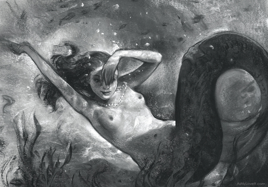
Part of my push to do this story was also attributed to when I explored full figure narrative pieces with chalk pastel and chalk pastel pencils during May 2017 for #MerMay. I was trying to work with this media at no larger than 9"x12". I think there was some success here. However, I feel I'll likely work larger for the book. It's more obvious what media I'm using with these pieces due to the small size. I think there is more of a mystery to the process when I work at a more comfortable size and I like that. That may mean some reeeeally big chalk pastel pieces, which is fine by me.
Student Work
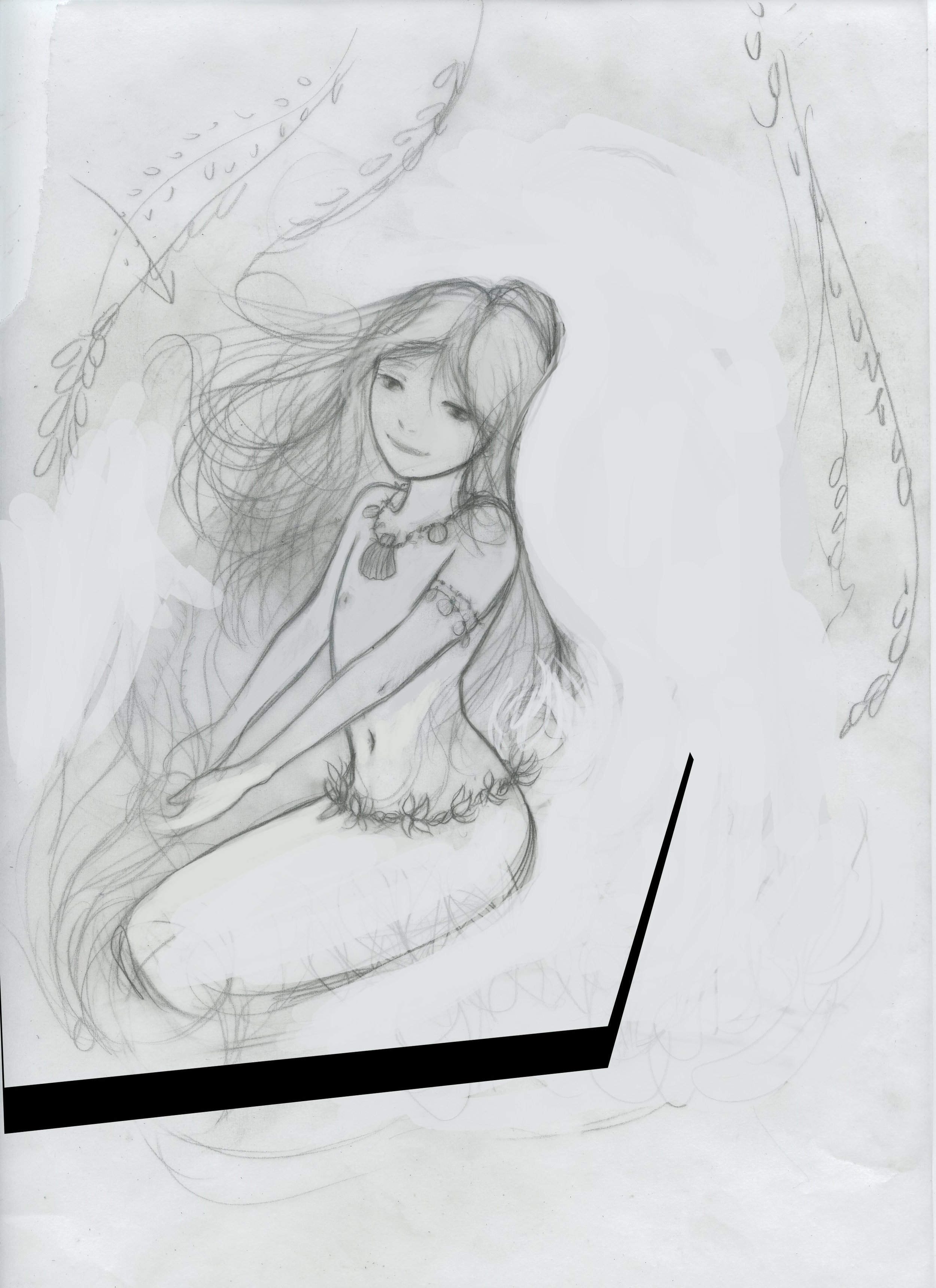
Below is my old process work from 2013 as a student. You can tell I was a bit wet behind the ears still (pun intended, hahahaha.) I did have a successful piece, which is the first image. It was a combination of a scanned drawing, a scanned chalk pastel texture, and a lot of digital work in Photoshop. I played with this technique for a while, but decided I hated grueling away at a computer screen. I eventually exclusively worked with chalk pastels soon after and you can learn more about that in an interview I did in 2016.
Predator
"If It Bleeds, We Can Kill It" is a chalk pastel original created for 30 Years Later at Gallery 1988 in LA.
You can purchase the framed original here in Gallery 1988's Store.
I start every illustration with thumbnails. These were done in acrylic paint in my sketchbook. This guy was pretty complicated, so I rented the movie and pulled references from it. I also looked up sculptures, behind the scenes photos, and even looked up collectors edition toys since they provided lots of photos and angles. I also watched a documentary about the film and it's characters to get to know what I was drawing. I didn't realize that they had a different monster in mind before the final Predator character. It's actually pretty funny looking.
I originally featured a full face drawing of Predator, but I was not satisfied with it. It didn't have a strong enough "bad ass" feel to to it. I decided to crop the image in to help showcase the blood. Cropping the image leaves more to the viewer's imagination and gives a creepier lurking feeling. The image on the left is good, but the image on the right is better. Cropping can have a very powerful affect on your work. This is something you should always consider even if it means covering up hours and hours of work.
Pan's Labyrinth Fan Art: The Pale Man
Why Pan's Labyrinth?
I've been wanting to do a fan art piece for a while now, so I left it up to my patrons on Patreon to vote on what I should do next! To get involved in my next fan art piece, joining my Patreon at Patreon.com/AshlyLovett.
Movie Plot Summary
In 1944, in the post-Civil War in Spain, rebels still fight in the mountains against the falangist troops. The young and imaginative Ofelia travels with her pregnant and sick mother Carmen Vidal to the country to meet and live with her stepfather, the sadistic and cruel Captain Vidal, in an old mill. During the night, Ofelia meets a fairy and together they go to a pit in the center of a maze where they meet a faun that tells that she is a princess from a kingdom in the underground. He also tells that her father is waiting for her, but she needs to accomplish three gruesome, tough and dangerous assignments first. Meanwhile, she becomes a friend of the servant Mercedes, who is the sister of one of the rebels and actually is giving support to the group. In a dark, harsh and violent world, Ofelia lives her magical world trying to survive her tasks and sees her father and king again. - Written by Caudio Carvalho, Rio de Janeiro, Brazil. IMDB.com
Process Work: Research Stage
With the beginning of each fan art piece, I start with my research behind my character and the story. I started with the color palette.
" I used the angular, cold world of fascist-era Spain to represent reality, and a very rounded and uterine world to represent the fantasy that the child escapes into. I guess you could say that I am obsessed with images of stillborn things, and seduced by the idea that the womb is the most comfortable place to be." - The Guardian (article link here)
I also found this fascinating article about the lighting objectives and how they worked with the film's low budget and struggled with their environment:
"'The initial color differentiation between the film’s two worlds was simple: Ofelia’s fantasy world would feature mainly warm colors, primarily “deep crimsons and golden ambers, almost like amniotic fluids,' notes Del Toro....In the Pale Man’s intensely warm environment, which is dominated by red tones and a blazing fire..." -American Society of Cinematography (article link here)
The Pale Man represents all institutional evil feeding on the helpless. In fact, this character is inspired by Saturn Devouring His Son by Francisco Goya. In an interview with Screen Anarchy Del Toro says, " The Pale Man represents the Church for me, y'know? [He] represents fascism and the Church eating the children when they have a perversely abundant banquet in front of them. There is almost a hunger to eat innocence."
It was also intended to be an old wrinkly man. However, during the sculpting stage, Del Toro wanted it more humanoid and suggested shapes similar to a manta ray. The creepiness factor went way up and they went with it. Read about it here.
Process Work: Sketch Phase
After getting a feel for the look and reason behind the character, I started sketching from the movie to get to know Mr. Pale Man better. I knew I had to include his eye hands in some way. It is a key feature of his character. Now how to do it best?
I didn't want to just take a screenshot straight from the movie. That's too easy and has been done time and time again. I wanted to showcase his wrinkles, the translucent skin, the blue veins, and I knew I wanted a long verticle to compliment his skinny form. I was lucky enough to come across David Marti's Instagram. He is the Co-owner of DDTSFX with Montse, the production company responsible for the prosthetics used for Pan's Labyrinth. There I pulled tons of reference from photos and videos. They were very helpful in understanding The Pale Man's body. I eventually found this gem of a photo on Google images searching "the pale man makeup team." (Side Note: Muddycolors.com put together an excellent post about googling references photos. Click here to read)
I did some Photoshopping-Frankeisteining and came up with a fabulous reference photo for my final illustration. From there I tapped 16x21 piece of BFK Rives paper onto my drawing board and went to town.
Process Work: Final Drawing
I work with chalk pastels on BFK Rives printmaking paper. The biggest challenge for this piece was controlling my values. I had to make a decision to either apply my details in the areas cast in light or shadow. Doing both would only make the piece overworked. Both sides would fight for interest. I chose the lighted areas. The second biggest challenge was designing the forms. This character doesn't have normal features (duh.) Normally I love working with the hair and the plains of the face to create depth, form, interest, and flow. I didn't have that option here, so I had to take great care with carefully placed shadows and highlights to show form.
The most fun was adding the highlights on his hands. It really helped it pop! I also enjoyed adding green throughout the piece to help bring out the reds since they are complimentary colors. Finding places to add subtle blues and purples was a fun challenge too. I didn't want it to be just reds, blacks, and yellows. I needed warm browns and other colors to liven up the overall palette. I used cold medium grey for the veins on his skull, arms, and chest.
Below are process images, close-ups, and 2 time-lapse videos of the making of this piece. I originally offered the time-lapse videos to my patrons, but I really wanted to share it for this blog post. So enjoy!
The final illustration measures 13"x21". Click the images to zoom.
I'm a big fan of Del Toro's work. My first fan art piece was of Crimson Peak (right.) Later this year I plan to do a Hellboy and another Pan's Labyrinth piece featuring the faun. I just need to put aside the time for this kind of personal work since I really enjoy it.
Month of Love: Hester Prynne
My piece created for Month of Love a yearly challenge held in the month of Feb. I'm thrilled to be a roster artist again this year. Each week artist are given a word to interpret.
The first week's word was "secrets." I originally thought I could do some spot illustrations to add to my portfolio. But eventually, after some doodling, I noticed offhandedly one of my sketches made me think of a pilgrim. And that train of thought made me think of the novel "The Scarlet Letter." Perfect for secrets and romance! Here is a plot summary for this novel.
Thoughts:
I feel good about the composition and the negative space which is intended to have text. I wanted to do more narrative work and play around with new lighting. I'm satisfied with the outcome. I wasn't sure about the solid A, but I think it balances well with overall drawing and shapes of the piece.
My reference/ inspiration gallery of photos and other artist work. Includes the amazing Audrey Benjaminsen, Sam Weber, Ed Kinsella, and others.
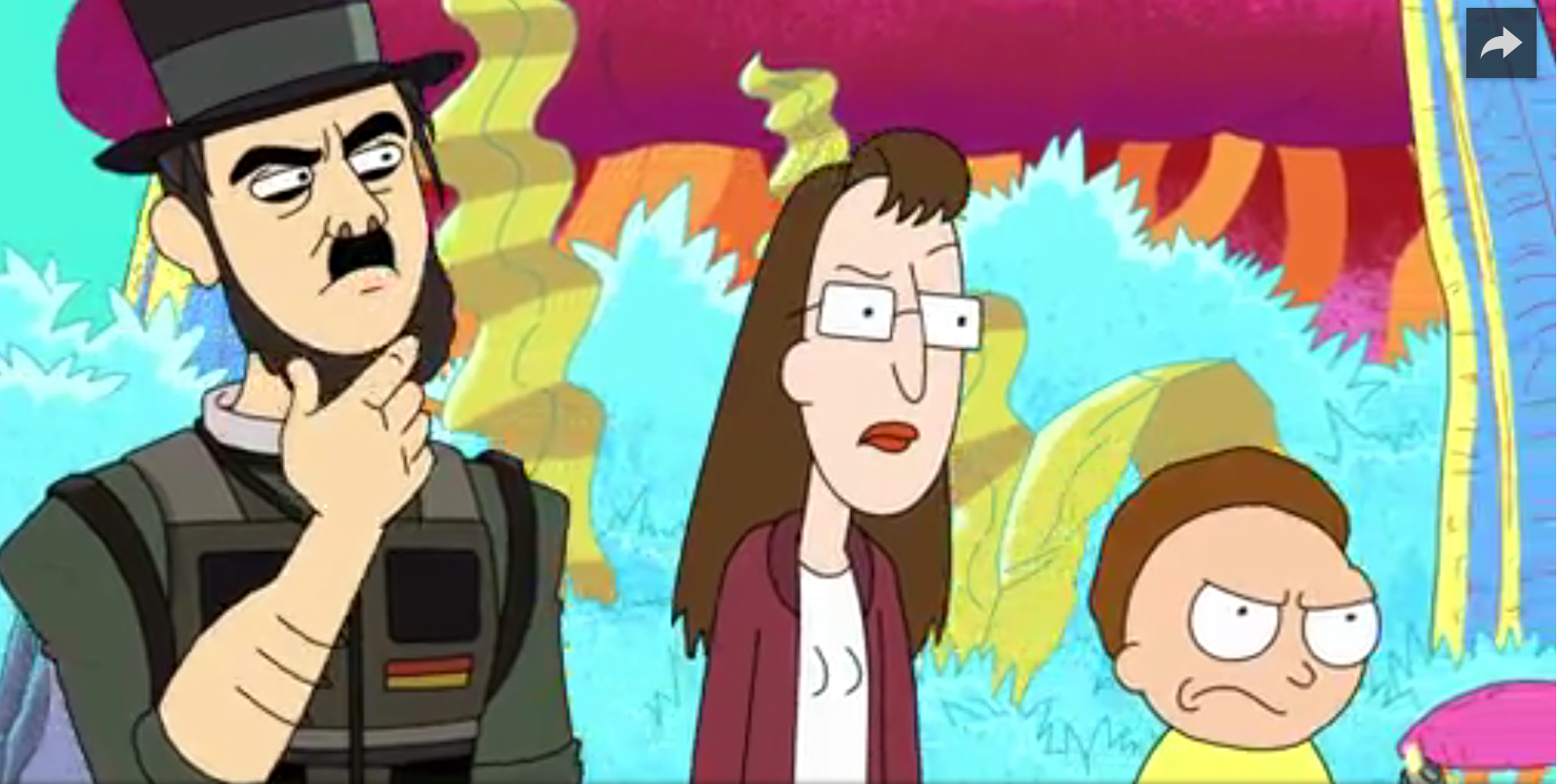
Rick and Morty Process Work and Demo Video
Very happy to announce that I'll be participating in 4 group shows this year with Gallery 1988 in Los Angeles, CA. They are well known for curating pop culture shows and I'm honored to work with them!
I'm starting off the year with the first official Rick and Morty art show, which opens tonight at 7pm-9pm at Gallery 1988 West. Rick and Morty is a cartoon featured on Adult Swim. If you can't attend, the show is online (click here.)
There you can purchase the originals (Update: Rick sold) or 1 of 10 limited edition prints (Update: First edition sold out. New 11x14 variant prints now available. Click here to purchase). Below is my chalk pastel piece titled "Rick" which will be in the show.
Process Work
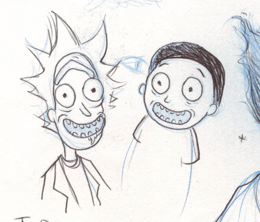
Sketchbook phase first. I needed to understand what made these characters look like "them". Learn the subtleties. I found that I needed to be careful with my line work and placement of the nose and eyes. Otherwise, they'll start looking like a muppet. After a few episodes, I eventually I got the swing of things. It's interesting that they make their pupils squiggly.
If you are unfamiliar with the show, it airs on Adult Swim and is moving along to a Season 3. This promo videos does better justice in explaining the show I think. Enjoy! It's hiliarious.
From the sketch phase. I collected reference photos from the show to get to know the color palette and wacky characters. My initial idea was to do a more illustrative piece, but even after a lot of process work, I decided against it. I love portrait work and that is what I sent the gallery when they accepted my portfolio. If I want to explore more illustrative work then it needs to be with another project. Always a good lesson to know it's ok to throw out hours of process work if the idea from the beginning is just not a right fit.
Time-lapse of my chalk pastel drawing of "Rick"
I wanted to make sure I didn't make Rick a nice guy. He is a selfish sarcastic old man who gets drunk all the time. I also really wanted to make sure he had a long face and hair that mimicked the same silhouette. And that uni-bro. I had to give it justice!
What about Morty?
After finishing my Rick portrait, I thought, "Why not do a complimentary Morty piece?" The deadline for the artwork was no later that Jan 6th and the gallery gave me the OK. I finished and shipped my Rick portrait framed and ready on the 22nd. I started a Morty portrait but realized I didn't want to rush it. Morty was a more difficult subject matter due to the fact that his character is made to be less interesting that Rick. I mean...it's not hard to make an eccentric drunk scientist with crazy hair into an interesting portrait. Also, Rick was an old man, which gave me many opportunities to play with lots of line work and interesting marks because of wrinkles. Morty is 14.
You have Morty who isn't very smart and below average in just about everything. His character is designed to look average. So it was a battle working out Morty's face while still trying to make his portrait stand alone. How to put in interesting mark making while still trying to keep him looking young and still in the same world as my Rick portrait? In the end, I decided it was better to just send in "Rick" for the gallery show and finish Morty as a fan art piece for myself. I'm happy with it and glad I took my time. And here he is.
To purchase the original Morty or get a Rick or Morty limited edition print Purchase Them Here at Gallery 1988's online store.
(323) 937-7088
gallery1988west@gmail.com
Rick and Morty is TM©Cartoon Network
Westworld Time-lapse Drawing
Freebie for you guys. I often share time-lapse videos on my Patreon and here is one of the latest.
Here is an impromptu chalk pastel drawing I decided to do of Doloris from the HBO series Westworld. You'll notice I play around with the placement at the beginning of this video. Totally not planned. I hope I can finish this up within the next few weeks.
See more process videos and tutorials on my Patreon:
http://patreon.com/ashlylovett
music ©Soundgarden - "Black Hole Sun"
Month of Fear Week 3: Door
Of course, I couldn't help but think of the book Coraline.
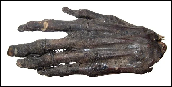
"Coraline’s mouth dropped open in horror and she stepped out of the way as the thing clicked and scuttled past her and out of the house, running crablike on its too-many tapping, clicking, scurrying feet. She knew what it was, and she knew what it was after. She had seen it too many times in the last few days, reaching and clutching and snatching and popping blackbeetles obediently into the other mother’s mouth. Five-footed, crimson-nailed, the color of bone.
It was the other mother’s right hand.
It wanted the black key."
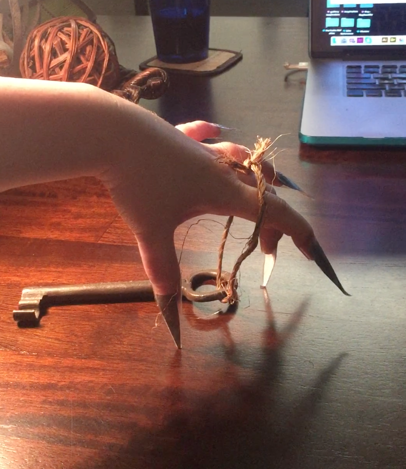
Below is my reference gallery of artwork (Dave Mckean and Sam Wolfe Connelly) and photos, my own reference photography (use of grey construction paper and packing tape), my rough sketch, and uncleaned up version.
This is not my first go with illustrations from the book Caroline by Neil Gaiman. If you'd like to see the process work involved in making the illustrations below, click this tag and scroll down to see everything: Category: Coraline
Month of Fear: Week 1 Secrets
Month of Fear is back! And here is my latest piece. This first week's word is "Secrets."
To learn more about this monthly challenge click here. To see my work last year, use the link on the right.
This piece went really quickly because I had a lot of things going on this month. I started with this thumbnail and let the idea tumble around in my head.
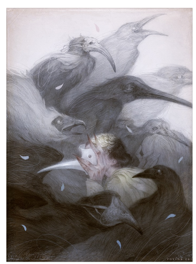
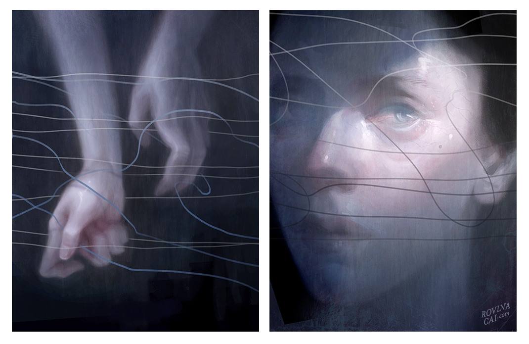
Art work inspiration from James Jean,Rovina Cai, and others.
Demo Tutorial and Video and EDO
Here is a 60sec sneak peak of my 5min demo video that accompanies my 11 page Process PDF Tutorial. With this Tutorial I explain how to use chalk pastels and demonstrate my method with a step-by-step guide in creating a black and white portrait. This is my June reward for my patrons on Patreon.
Get all my tutorials, see in-depth blog posts for illustrations, and many other goodies by pledging Tier 3 for $11. Learn more at http://patreon.com/ashlylovett
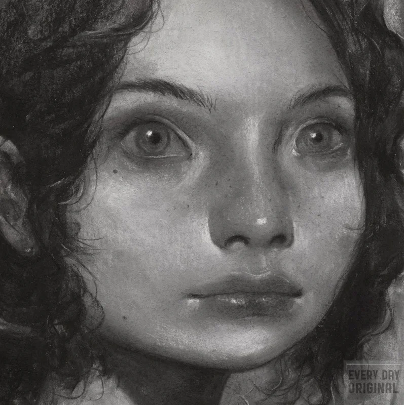
This piece is titled "Fae" .It is a 4x6 chalk pastel piece on BFK Rives paper. It will be framed and matted and available at Every Day Original Sun., July 10th 11am EST. http://everydayoriginal.com
Month of Love Surprise! Seasons: "Peony"
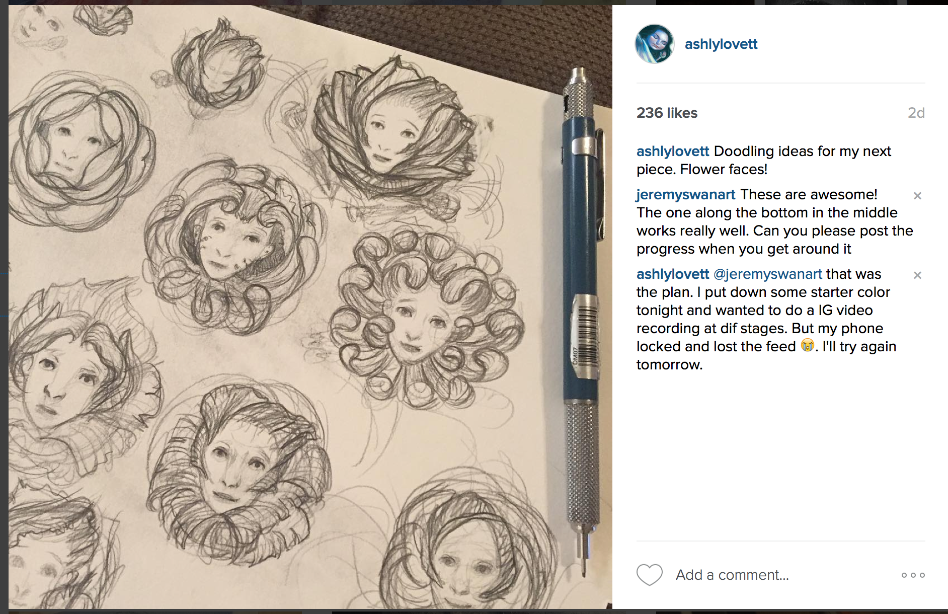
The roster artists did a secret one last Month of Love day for the leap year! The theme was seasons and I highly suggest you check out some of the amazing work displayed today. I personally been wanting to do a series of flower faces. For this piece it needed to be bright and colorful! It is spring, which is full of life and energy. I do a lot of horror themed work and this is a good change in pace.
I notice people really like these time-lapse video, so I'm going to try and post longer ones. After seeing the color quality of this video, I'll be researching cameras. The color is SO far off, but at least you can still see the values clearly. In all my videos I do lot of trial and error till I'm happy with the color and drawing. I think this history of color is what gives my illustrations more life. I also want to say that it is truly useful to not be precious with your work. Sometimes you need to be willing to destroy your illustration, so you can build something better. It may help to think "If I did it once, I can do it again." An excellent artist to follow for this is Vanessa Lemen. She did 2 post on Muddy Color: Painting Process and A Spontaneous and Responsive Process.
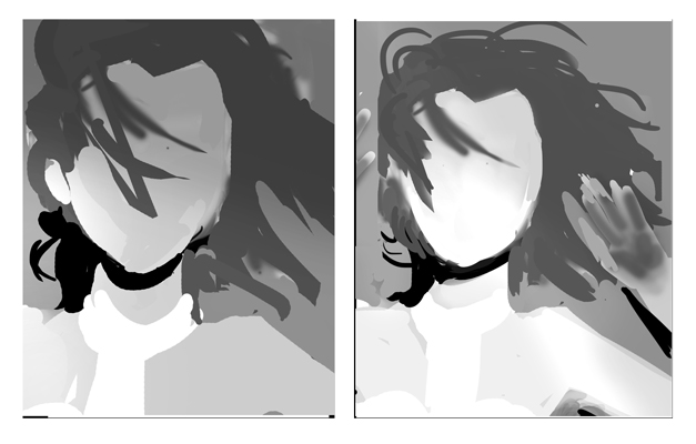
In my last post I spoke about implied lines in my composition. As you can see below (middle image) I use a lot of implied lines to help your eye travel around the flower petals in a spiral. I then had to use the background to keep your eye within the center. Because I used such a blunt and centered composition, I wanted to continue this theme of symmetry by making the subject looking directly forward. Everywhere outside the face has a lot of energetic, organic lines and the smooth face makes a great contrast and gives the eye a place to rest. And with all these swirling organic shapes everywhere, I knew I needed to anchor the piece was horizontal implied lines (far right image.) My line work is naturally organic and an instructor pointed this out to me one day. Since then I try to incorporate geometric (strong horizontal and vertical) line work to help contrast and strengthen my organic way of working.
I turned to a lot of my favorite artists for this project. James Jean and Loish were big influences I think. I also really wanted the character's face to have very open bright eyes. I thought instantly to the Forest Spirit in Princess Mononoke. I always loved how "knowing" those bright eyes seemed.
Month of Love: Lost in Translation. "Leeloo"
Each week of the month of February, I'll be doing an illustration based of the given word or phrase. Learn more about Month of Love here. You can also check out my pieces from the last challenge Month of Fear.
This weeks phrase: Lost in translation. The Language of Love has many dialects. Sometimes we’re fluent and other times… it’s all Greek.
Challenges for this illustration:
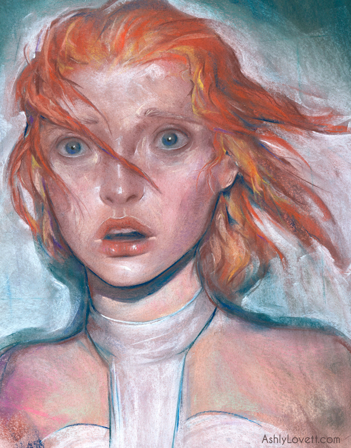
* Trying to depict Milla Jovovich's character, while still retaining my style. This was very tricky. I ended up re-watching the movie and taking a lot of screenshots. I couldn't get a straight up great reference photo. This was a good personal challenge for me. I also researched all of Milla's photo-shoots during 1995. She is so purdy. I felt the key would be to nail her mouth since it is her most distinct feature. Also, Leeloo often had an opened mouth expression.
• This scene illustrates her first moment seeing futuristic New York and the cops have her in a spotlight. The face is practically fully lit, which can flatten everything. I really had to control my values, control my line work, and use what shadows I had to balance everything. Usually, my pastel strokes are smooth and organic and I'll love to render out areas like the hair. But considering the chaos and anxiety of the scene and the high key values, I wanted more energy to compensate that. So, I used hard strokes within the face and kept the hair mostly gestural.
• I originally wanted to have her hands up covered in soot, like in the movie. However, I nixed it because I felt the piece was too busy with more information. I also tilted the composition to make it more dynamic.
Project Description: It took me a few days thinking on this week's phrase. It was very hard not to just think of the literal movie, Lost in Translation. Luckily one morning Leeloo popped into my head! I find my best inspiration when I'm initially waking up in the morning and cruising through artwork on IG. Leeloo is a supreme being that is awoken 5,000 years later to a future with flying cars and space travel. She was created as a weapon to save the human race from a “great evil” that is literally a dark planet hurtling towards Earth to destroy everything. I felt Leeloo’s journey was a good fit for this week’s challenge. From the beginning of her waking, she dealt with controversy. And when she looked up the word “war,” she became even warier of humans and their overwhelming will to destroy each other. It took good ol’ Bruce Willis (playing Corbin Dallas) to explain that there are many things worth saving, like love. He then kisses her and she’s a happy weapon again and destroys the “great evil” seconds away from its impact with Earth. Fin.
Side Notes: At the end of the film, Leeloo really gives Corbin quite an ultimatum. Say you love me or Earth dies, lol. All kidding aside, this is a beautifully entertaining movie. One of my favs.
Month of Love: Hero. "Girl with the Dragon Tattoo"
It is now Month of Love! This is very similar to Month of Fear. Each week of the month of February, I'll be doing an illustration based of the given word or phrase. This weeks word is "hero." Learn more about Month of Love here. See my entry here!
(Spoiler alert for book readers) I wanted to do a hero that isn't the typical "hero" image. Set during winter in Stockholm, Switzerland, Lisbeth Salander from The Girl with the Dragon Tattoo is a 24-year-old 4' 11" petite woman weighing hardly 100Ibs who dresses like a goth with piercings and tattoos. She is often mistaken for a 14-year-old. At the time I read this novel, I related instantly to this character because I too was in my early 20s, 4' 11" (no joke), petite, and often (SO OFTEN) mistaken for a teen. Throughout the novel, there is this constant motif of inaccurate judgements due to one's appearance. Lisbeth Salander is laconic and withdrawn to the point that she is judged by others to be incompetent. But in reality, however, she is an extraordinarily intelligent hacker and very capable of taking care of herself. She dishes out justice to those who wrong her and even saves Mike Blomkvist life at the end of the novel. Lisbeth Salander is one of my favorite female protagonists. She is misjudged due to her personality, her past, and appearance. Ultimately, she uses the misjudgments of others to her benefit.
Throughout the text, Salander occupies the role of both victim and survivor. Assaulted repeatedly and brutally by her guardian, Salander seems aware that others perceive her as a victim, but she doesn’t view herself as one because she sees the oppression and brutalization of women as endemic to society. In other words, she is not being singled out for abuse, and so views the abuse as a general problem rather than one directed at her personally. Ultimately, her notable outbursts of violence against her guardian in the novel exemplify both Salander’s desire to secure her own survival in the face of overwhelming odds and to punish those who victimize the powerless. Additionally, almost all of Salander’s actions serve to secure her independence and give her the means to protect herself.
Crimson Peak: Thomas
After watching that movie I was bouncing in my seat from all that art eye candy or as Guillermo Del Toro put it "eye protein." Every frame was breathtaking. There is one scene at the beginning of the movie featuring a social event. And I swear frame by frame it looked like something out of a painting. And the house...I could go on and on about how beautiful that movie was. You could tell all the designers put their heart into that production.
With all that said, I really wanted to do an illustration in honor of that amazing film. Even though I was rambling to my husband as we left the movie theatre about how gorgeous my next illustration was going to be, I was actually overwhelmed by the time I got to my studio. I want to say SO much, but what to say and how to do it?
So while I try to dissect this more involved illustration for Crimson Peak, I had to do something to satisfy this desire. Thus this chalk pastel portrait Thomas
Month of Fear: Mirrors
I wanted to participate in this year's Month of Fear, which is " a weekly art challenge created by Kristina Carroll for the month of October. It was designed to inspire artists to get together, shake things up, push themselves and create a bunch of new personal work. We do another monthly challenge in February called Month of Love."
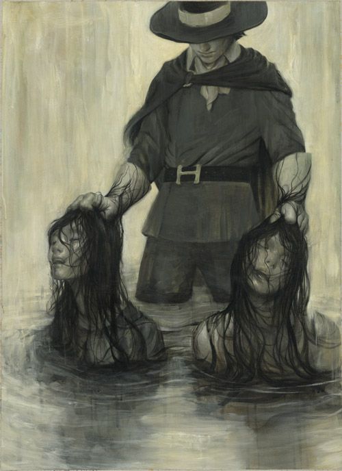
This week's word was Mirror: Reflection, deception, spirits and secrets.This is darker than most of my current work, but I wanted to step a little further out of my circle and challenge myself with a more serious piece. This one is titled "Reflection". Next week's challenge is: Sabbath Witches and devils.
These process images are crude and taken with an iphone, but in my defense these were intended for my own personal documentation and not a demo. So here it is: I sketched in my base drawing with nupastels. Next, I went over certain areas with a sponge brush soaked with water. It gives the pastel a "paint" quality and dries with interesting textures that I knew would work great for this concept. I want to stress that this was done on BFK Rives cotton rag paper, so it doesn't buckle. Once dried it was a process of refining my shapes and trying to give it that foggy mirror look, which was an interesting challenge. The solution of using a fogged mirror helped make this story less gruesome and more appealing to a broader audience. ;)
Every Day Original: Claire
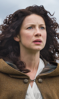
I start all my portraits off very vague and slowly try to find a drawing within my shapes. Sometimes I find inspiration from music or possibly what movie or audiobook I'm listening to. This past week I caught up on the TV series Outlander (also a great book series) playing on Starz, which features female heroine Claire Beauchamp Fraser. So unintentionally my drawing ended up reflecting a lot of Caitriona Balfe's features. :)
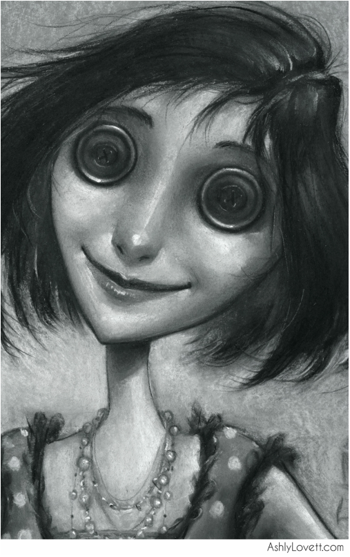
The Other Mother
As you can see from my portfolio, I am a big fan of Neil Gaiman's book Coraline. I'm in love with the visuals and the way it is written.
I wanted to do a spot illustration of the other mother when she is first introduced to the reader.
It sounded like her mother. Coraline went into the kitchen, where the voice had come from. A woman stood in the kitchen with her back to Coraline. She looked a little like Coraline's mother. Only...
Only her skin was white as paper.
Only she was taller and thinner.
Only her fingers were too long, and they never stopped moving, and her dark-red fingernails were curved and sharp.
'Coraline?' the woman said. 'Is that you?'
And then she turned around. Her eyes were big black buttons.
'Lunchtime, Coraline,' said the woman
'Who are you?' asked Coraline.
'I'm your other mother," said the woman. 'Go and tell your other father that lunch is ready.' She opened the door of the oven.
Coraline Spot
"Coraline wondered if the other mother wasn't interested in trees, or if she just hadn't
bothered with this bit properly because nobody was expected to come out this far.
She kept walking.
And then the mist began.
It was not damp, like a normal fog or mist. It was not cold and it was not warm. It felt to Coraline like she was walking into nothing. "
- from Coraline, by Neil Gaiman
This particular spot is when Coraline is walking through the woods in the other mother's created world. I always loved the imagery of this passage and was inspired to do my own spot illustration for it. Below are close-up and further down is some of process my work.
I knew I wanted an illustration of Coraline walking through a forest that rapidly had trees started turning into "an idea of a tree." I usually already make my backgrounds suggestive and loose, so it was a fun challenge working with my style and still having my illustration read as a forest turning into nothingness rather than an illustration that isn't finished.
My initial sketches and media test: